Web Accessibility Quick Test
For a very quick self-test on how accessible a website is, try these three quick tests.
If a website site fails any of the below tests, then the site is not fully accessible.
These are only a few of the tests required, and should not be considered exhaustive. However, they do provide a good indication of a site's general accessibility.
Test 1 - Navigating with the Tab key

Try to explore your website without using your mouse. Put your mouse well out of reach so that you are not tempted to cheat!

To navigate without a mouse you press the Tab key on the left of your keyboard. Each time you press the Tab key you select the next navigation button or hyperlink on the page. (Use the Shift key + the Tab key to go back to a previous link).
When you are on the required button or hyperlink just press the Enter key to go to the new page. If you find that your site is impossible to navigate without using a mouse then the site is not accessible to disabled people.
Test 2 - Alternative text for images
The images and pictures on your website are stored separately to the text. Visually impaired users may not be able to see the images - but they still need to know what the picture was about.

This is done by including an alternative piece of text that shows up if the image does not arrive, or if the user holds the mouse cursor over the image for a moment. This is called the "alternative text tag" or the "Alt Tag".
The picture on the right shows how the alternative text tag is displayed as you rest your cursor for a second over the image.
Use your mouse to rest the cursor on the image to see the alt tag I have added.
If the alternative text is not available, it makes the website less accessible.
Test 3 - Large text option
People with poor eyesight may need to adjust the size of the text on your websites.
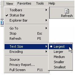
To check if people can change your text size, select the View menu in your browser toolbar, from the pull-down list select Text Size and click on the Largest option.

If your pages have been written using the proper html codes you should see the text and links on your page written in a larger font size. This means that the website developers have used proportional font sizes.
If the text size remains the same then they have used fixed, or absolute, font sizes and people with weak vision may not be able to read the content.