Stories from Copenhagen (Copen-heaven if you love good UX)
Information Services' UX Developer, Claire Alexander visited the Copenhagen School of Design and Technology in May.
Here she tells us about her visit:

Good UX is all around!
In Denmark good UX is in their DNA. They seem to intrinsically understand that how people feel is important, and things are designed with consideration to the humans who are going to be using the thing. Yes, I know this is how it should be, but so many things are not designed this way – cost or ease-of-production are often the priorities. Of course, these things are important, but do they have to be at the expense of human experience ?
OK, admittedly I’m in Scandinavia – the home of good design, and I’m spending a lot of my time at KEA, the Copenhagen School of Design and Technology, so you might expect a strong focus on design – but I’m not talking about uber-cool designer-y design, I’m talking about their user experience design – their ability to combine practical functionality with beautiful, pleasing form. It’s everywhere – the chairs in the fairly basic hotel I’m staying in – beautiful to look at but oh so comfortable to sit in; the blankets left on the terraces outside the cafes – not any old blankets, but warm, tasteful and made from quality natural fibre, positively inviting you to wrap yourself in them when it turns chilly.

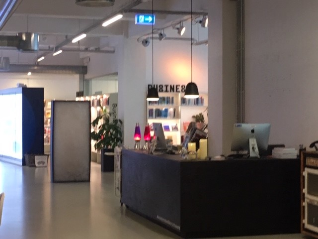
The main desk in the KEA library
But the student library at the KEA Institute is the epitomy of good user experience. I could talk about it all day, but I’ll give you the condensed version… Firstly, the lighting – bright enough to study yet soft enough to create a relaxing, calm ambience. It has been so thoughtfully designed and comes from multiple sources – oversized hotel-style ceiling lamps, soft LED lights at different angles, simple (but soft) strip lights, and natural light from the large windows. The effect creates a place you just want to spend time in. I wonder if others notice how clever it is? Maybe not, but they certainly feel the effect. The place is full of students at work (on a Friday afternoon!) and they seem happy to be there. It took me a minute to actually realise I was in a library, the whole place is designed to feel like a relaxed lounge, with wallpaper, sofas, plants (lots of them) and candlesticks (yep) but without seeming contrived (honestly!). I stopped a few students on their way in to the library to try to find out their views on it. Their comments were ‘It doesn’t feel like we’re in a library’, and ‘We have everything we need here’. Very very good UX.

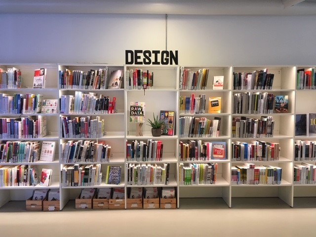
Bookshelves in the KEA library
A reading area in the KEA library
So anyway, the real reason I’m here is not to gush over the amazing library, but to spend time with the web team here at KEA – to find out about their approach to designing large-scale further education websites and intranets. Last year I was researching higher education websites and amidst a sea of very similar-feeling university websites I came across KEA. It stood out, not just because of the stylish design of the interface, but also because of the apparent simplicity of the structure and content – a website that manages to be what all UXers strive for – useful, intuitive and downright delightful! I wanted to know how they had managed it, and wanted to know if their students agreed. When I found out they were planning a redesign of their staff intranet and their student intranet, I thought I would invite myself over for a visit, to see what I could learn.
They are admittedly a lot smaller than Edinburgh Napier – only around 1000 students and just 33 programmes, so in some ways they have a lot less complexity, but their website is definitely scalable and their approach is interesting.
The lovely people in the KEA team have been extremely accommodating. I’ve found out about their major website redesign project, how it was managed, some of the pitfalls they’ve experienced along the way (ditching the initial development company), and some of the successes. Some things that really stood out to me are:
1. Just Enough Information
Their very definite view of ‘Just Enough Information’. Not overloading a website with every possible piece of information, but being selective about the important stuff, and directing users to other resources for more details.
2. No to ‘Inside Out’
Clamping down hard on anyone with what they call an ‘Inside Out’ approach, i.e. allowing website content to be dictated by what is important to the organisation but not necessarily important to the user.
3. Not trying to be all things to all people
Being clear about who the users are and using separate websites to show only the information relevant to those users.
They use separate sites for things that are large enough and different enough to justify it, but always using the same platform. For example the library has its own website. (They would definitely put research on a separate site!)
The advantage of this approach is that there is a very clear focus for each digital offering and it empowers the owner responsible for it. Because there are a range of staff who understand how the content management system works, it means they can also share resources like content producers, graphic designers, marketing staff if they absolutely need to,
4. Using the same technology wherever possible
They have different websites for different purposes, but all four sites are built on the same platform (Joomla) using the same technology. This allows an efficiency of technical resource.
A few other notable points:
- Interestingly, they previously used Sitecore, but decided to move to Joomla because they found Sitecore too restrictive and too expensive. They are happy with the move to Joomla.
- Instead of an internal development resource, they work very closely with a local development company for everything to do with the website development.
- A huge convenience for KEA is that in Denmark, most of their internal forms are produced by a centralised government body, so things like Expense Forms, Travel Requests, Procurement Requests, Leave Requests, Absence Forms etc are all available in one central location.
- Their room booking system is managed by telephone, and new staff authorisations are done directly with HR, so no forms are involved.
They certainly don’t have everything right – for example, they don’t currently have a student app, and they don’t do as much user research as they would like – but getting a view into their approach has certainly been food for thought.
In some ways, it’s not too different from what we do at Napier, but having a very clear philosophy, a clear structure, and using the same technology where possible certainly seems to have a lot of benefits.
I’m looking forward to discussing all of this with my Edinburgh Napier colleagues and seeing how we can take a little bit of KEA to Edinburgh.
Thanks to Erasmus for funding this visit.
The canteen at KEA

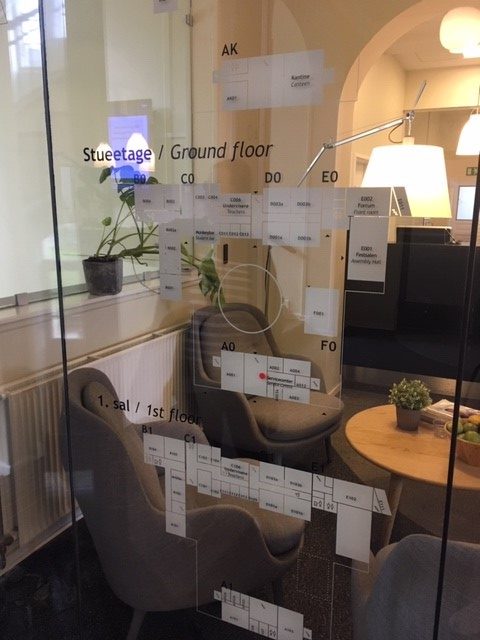
A map of the campus on a glass wall at reception